Enhancing usability and engagement of the onEdu mobile app by addressing real student frustrations—streamlining course management, attendance tracking, and deadlines for a frictionless learning experience.
Brief
onEdu, a widely-used learning management app for Indian universities, faced critical usability issues that left students struggling with navigation, attendance tracking, and task management. I led the end-to-end design overhaul addressing this.
Result
My redesign streamlined course management, attendance tracking, to-dos, and assignments, significantly improving usability and reducing friction in student workflows.
Prototyping + Wireframing | Figma
Research Synthesis | Figjam, Google Docs
Timeline | May '24 - December '24
Team | 2 designers, 3 business & research analysts, 4 engineers
onEdu supports over 1 million students across 20+ universities in India
The System Usability Score of the app improved from 65 → 85 (n=130)
Related support tickets dropped by 81% within the first 2 months
onEdu’s brand language was fragmented, with no cohesive design system across platforms. This inconsistency not only weakened the brand visually but also affected usability and overall user experience.
Students depended heavily on onEdu’s dashboards and data visualizations to make key academic decisions—such as tracking attendance and managing assignments—but the existing dashboards lacked clarity, often leading to confusion and poor decision-making.
While addressing usability issues was non-negotiable, I pushed for a complete overhaul of the brand identity and design system. My goal was to signal to users that onEdu had been renewed—elevating it into a more user-centric, reliable, and trustworthy product.

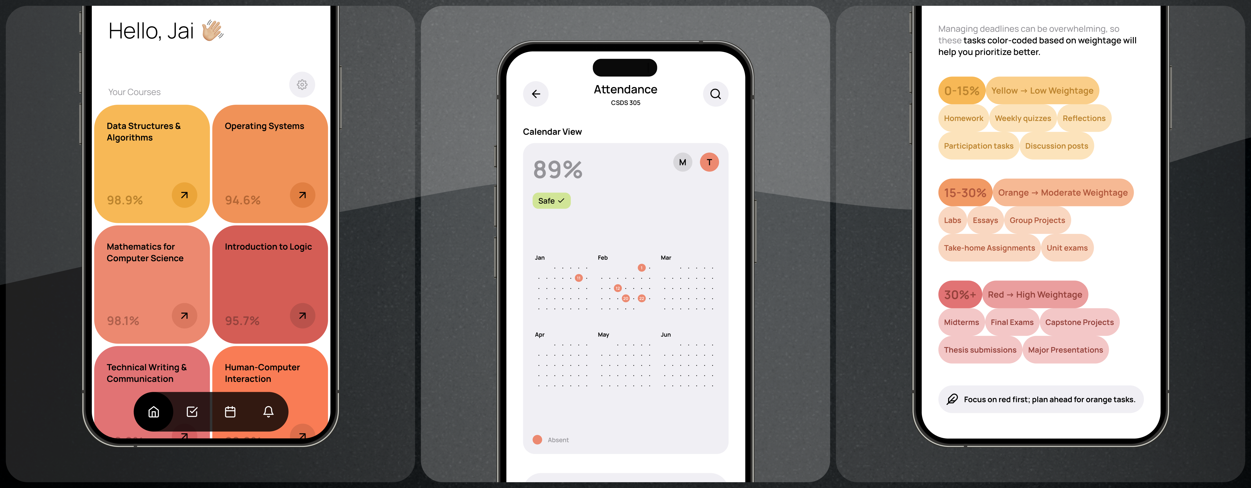
A great learning app should feel effortless—but for students using onEdu, everyday tasks like checking attendance, tracking deadlines, and finding course materials were frustrating and inefficient.
Here’s how I redesigned onEdu’s core features to be simpler, smarter, and more intuitive.

The onEdu mobile app was essential for students across Indian universities but suffered from critical usability issues which made everyday academic tasks frustrating.
With an increasingly critical abandonment rate for the student app, Winnou needed to swap band-aid solutions for an end-to-end design solution that addressed real student frustrations.


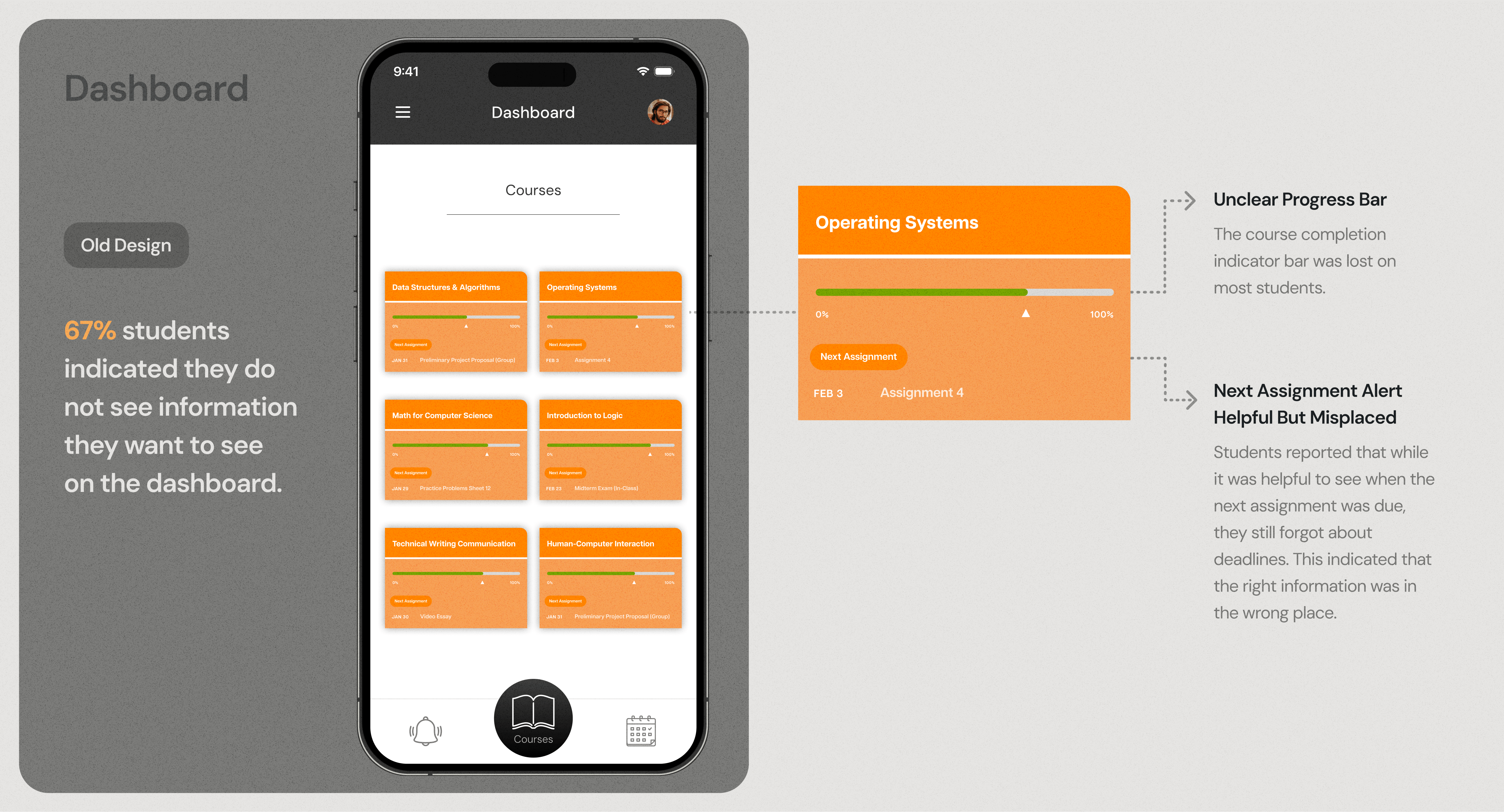
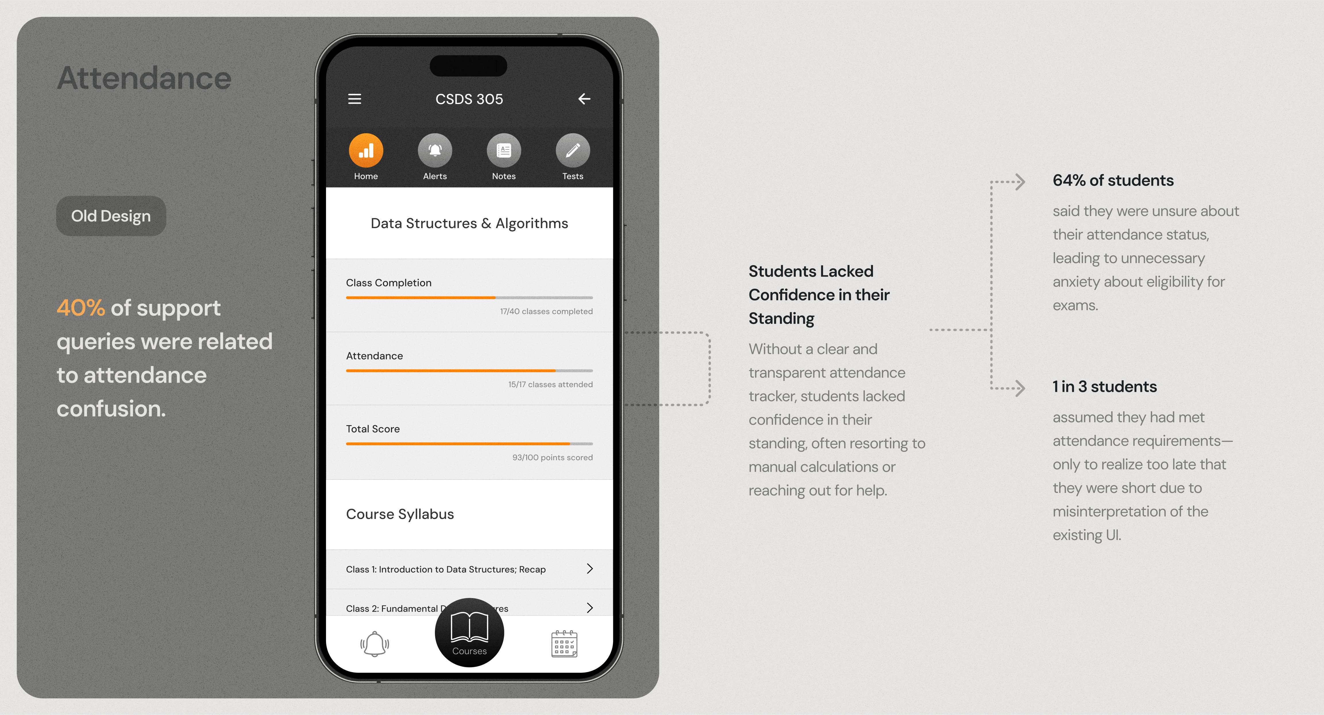
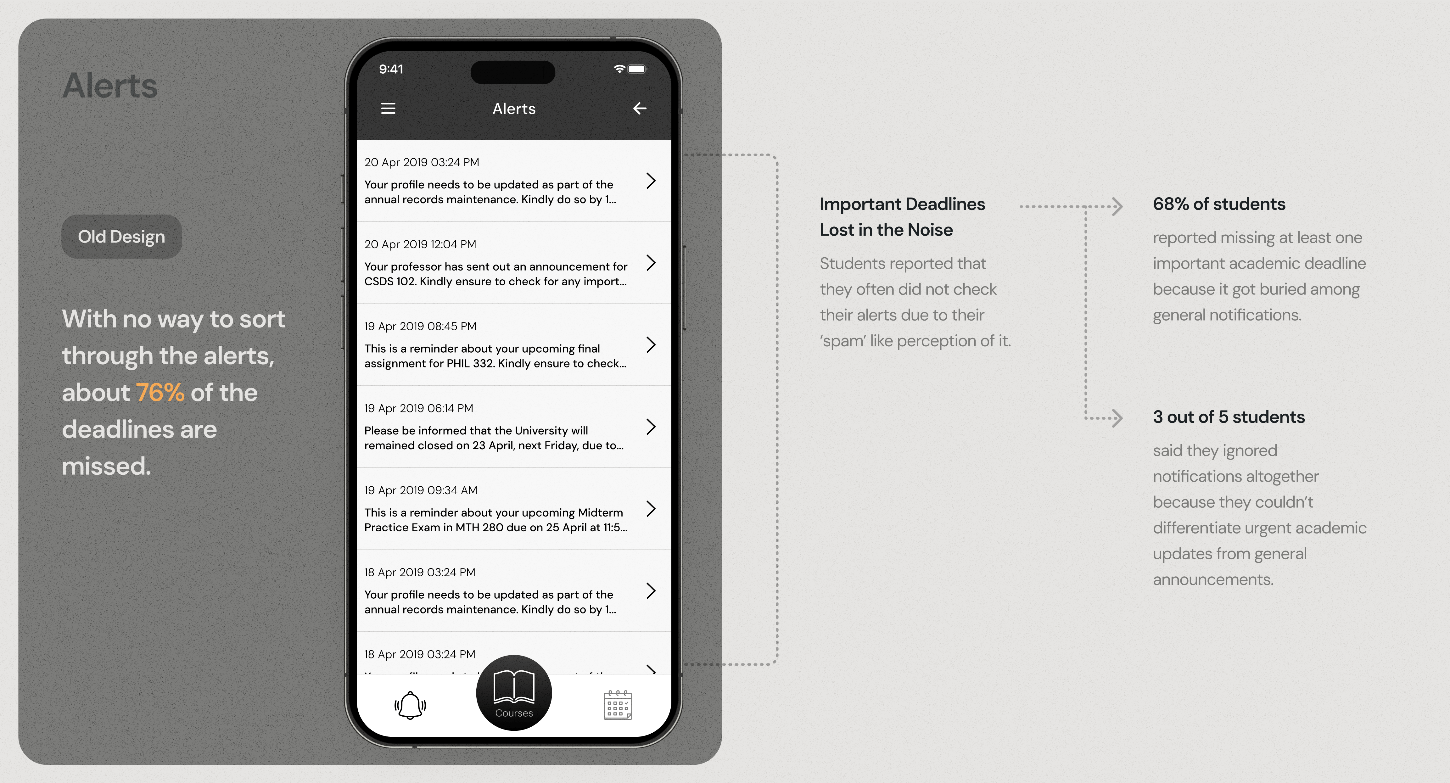
With needs and goals clear, I took a strategic, impact-driven approach to redesigning onEdu’s core features. The goal was to eliminate friction, improve clarity, and enhance student engagement.
With multiple usability pain points identified, I focused on areas that directly affected student performance and engagement—fixing them would have an immediate, measurable impact.
Of the 10+ feature redesigns, I present 4 which had a significant immediate and measurable impact.
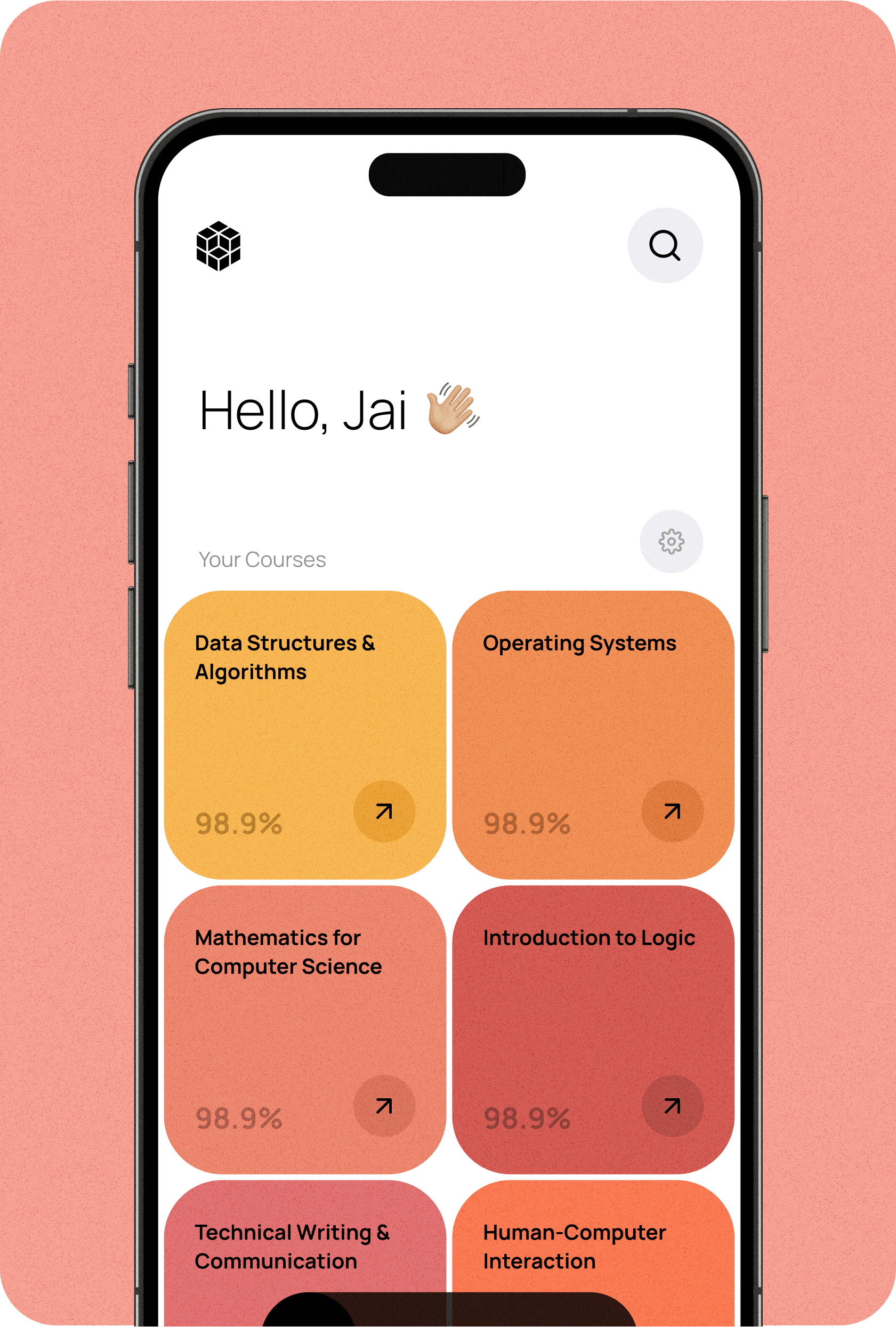
Streamlining navigation with a prominent search component for quick access to materials. Less relevant information switched with grade status on course card.
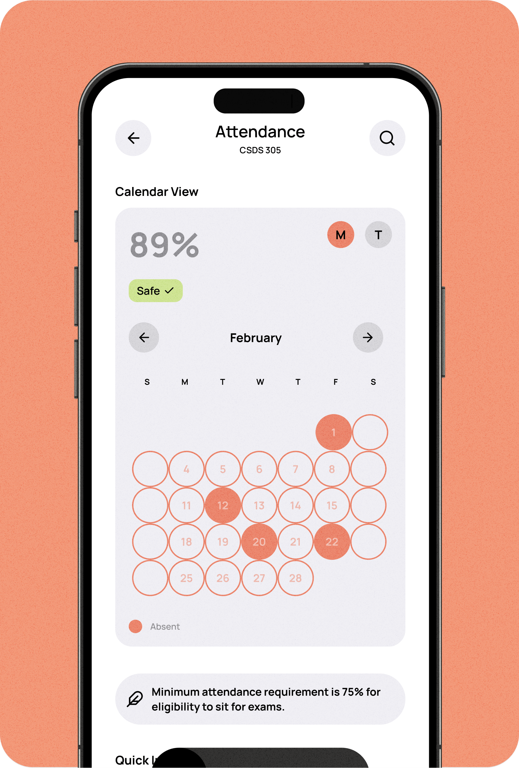
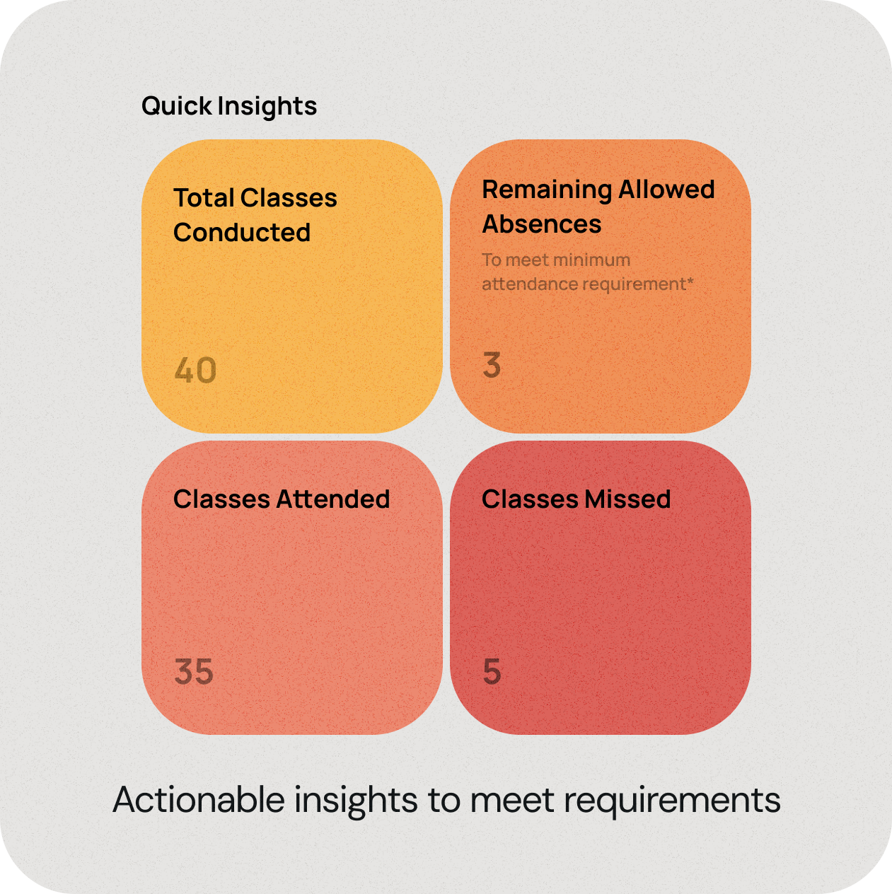
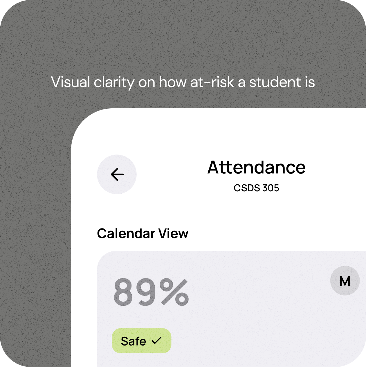
Removing ambiguity and ensuring students can track their status at a glance by introducing progress indicators and warnings for low attendance.
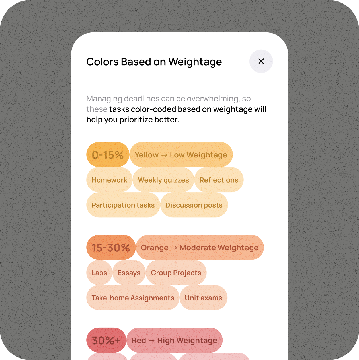
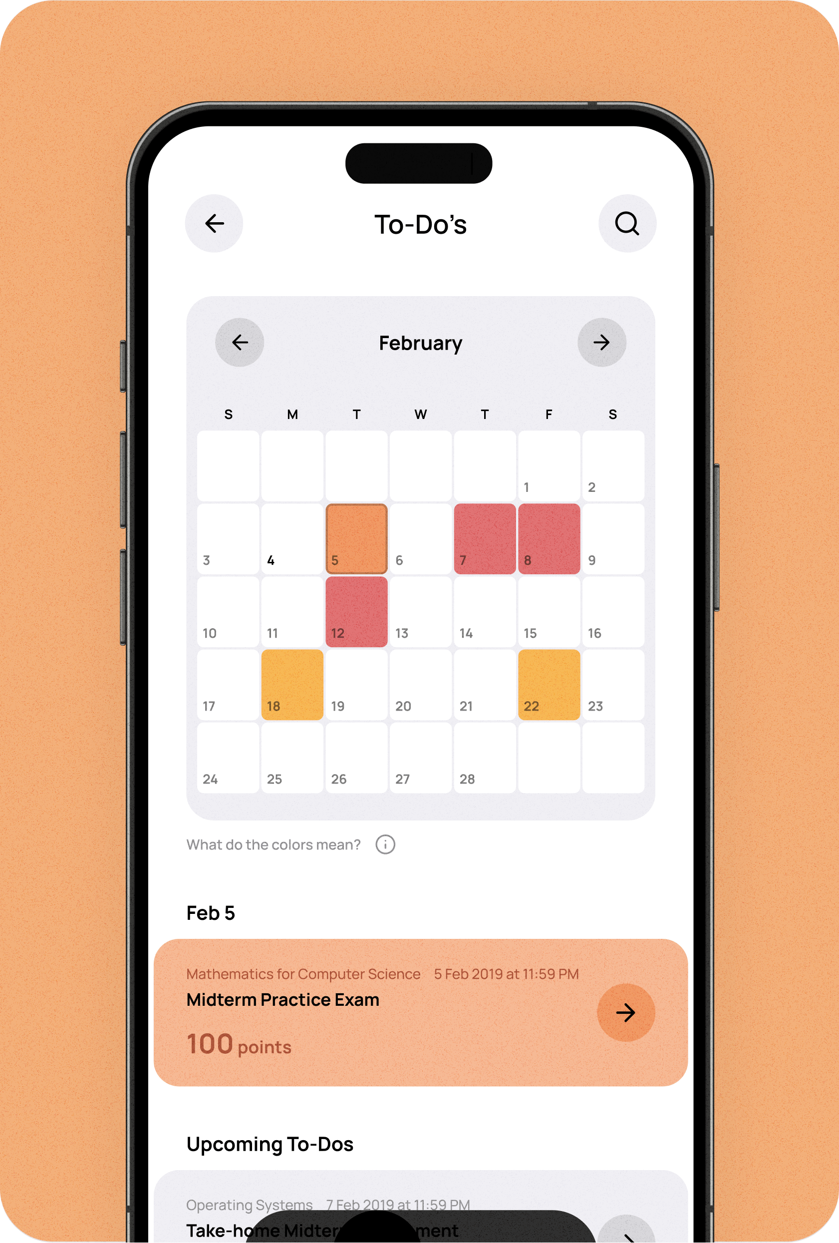
Creating a dedicated To-Do’s section and ensuring that academic priorities remain clear, structured, and actionable.
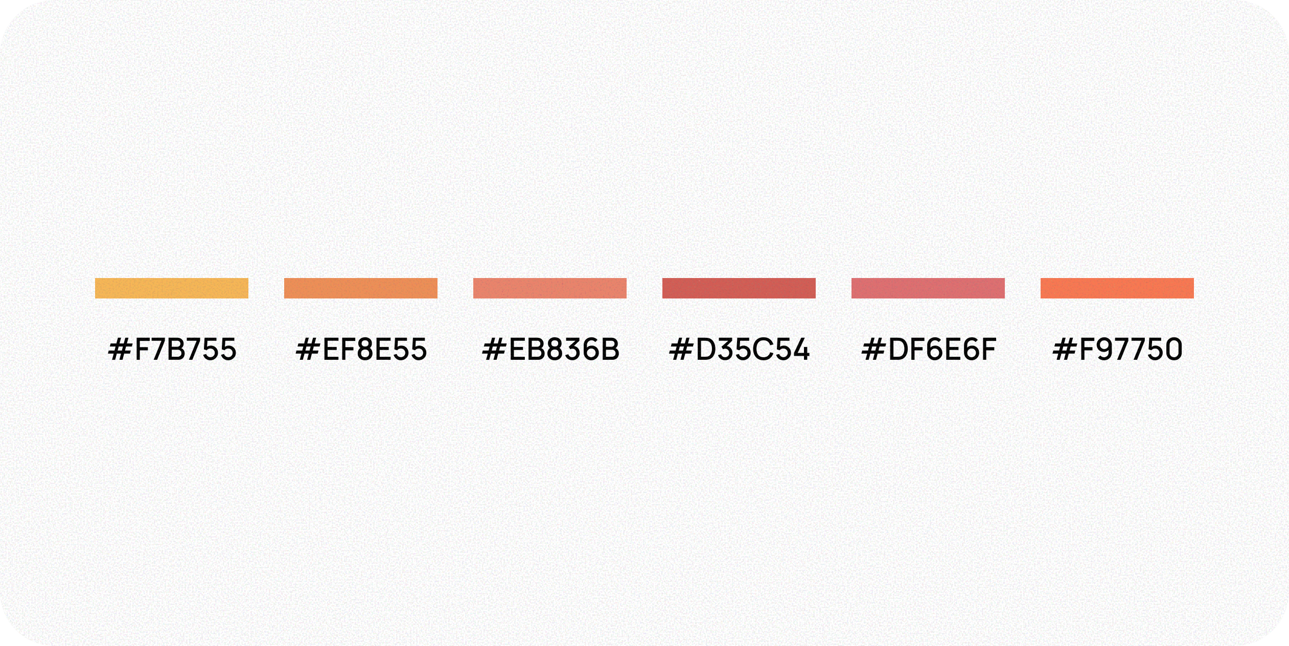
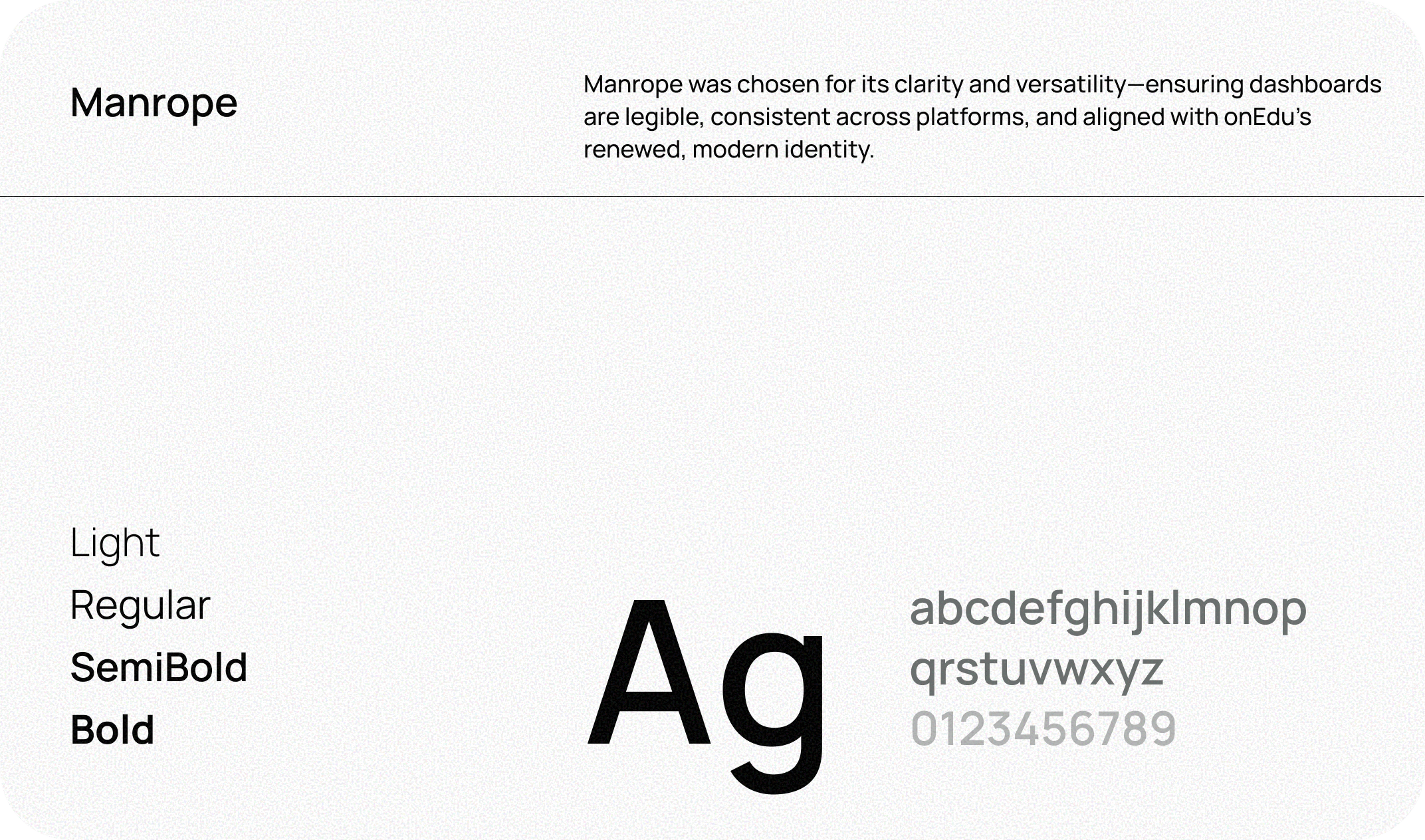
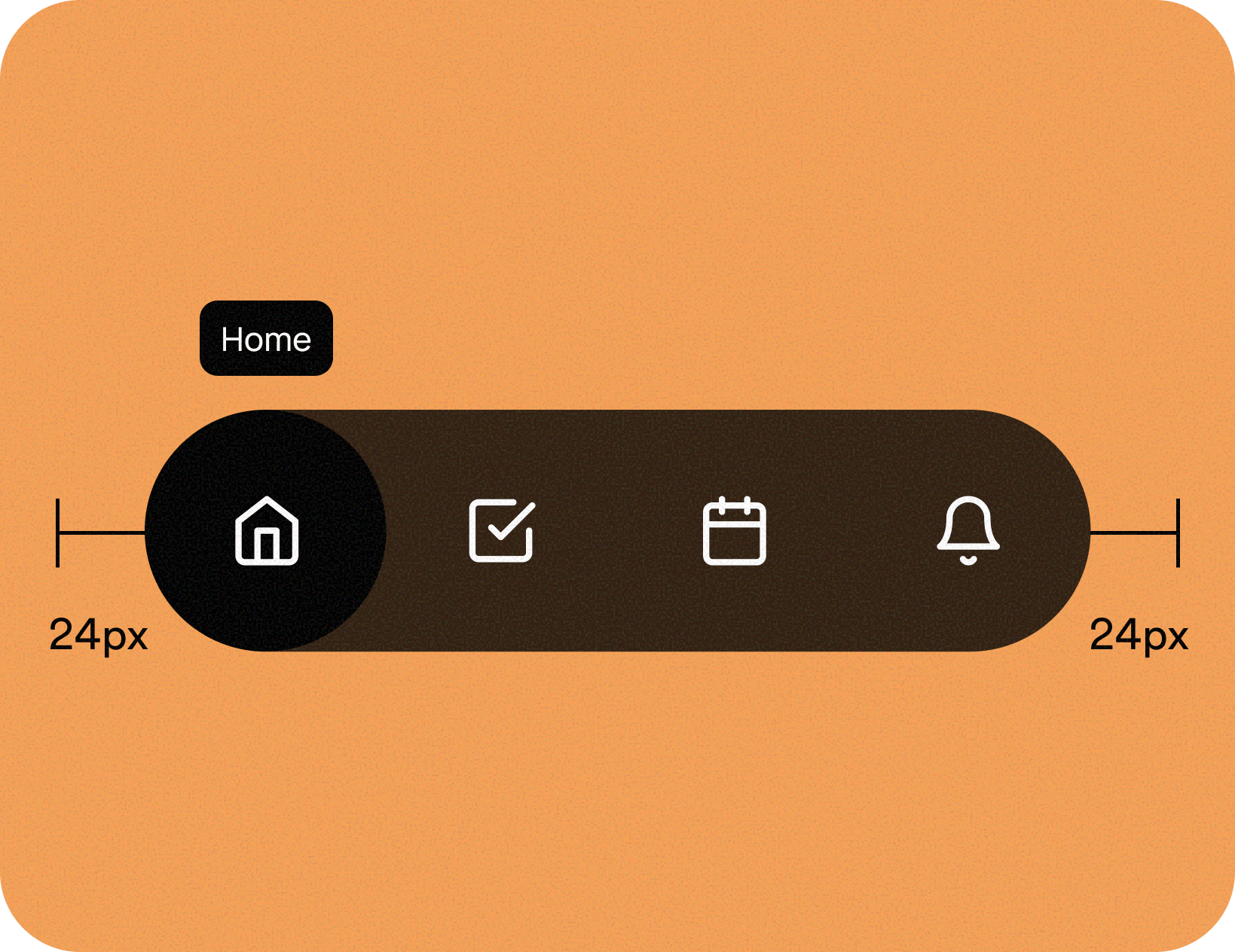
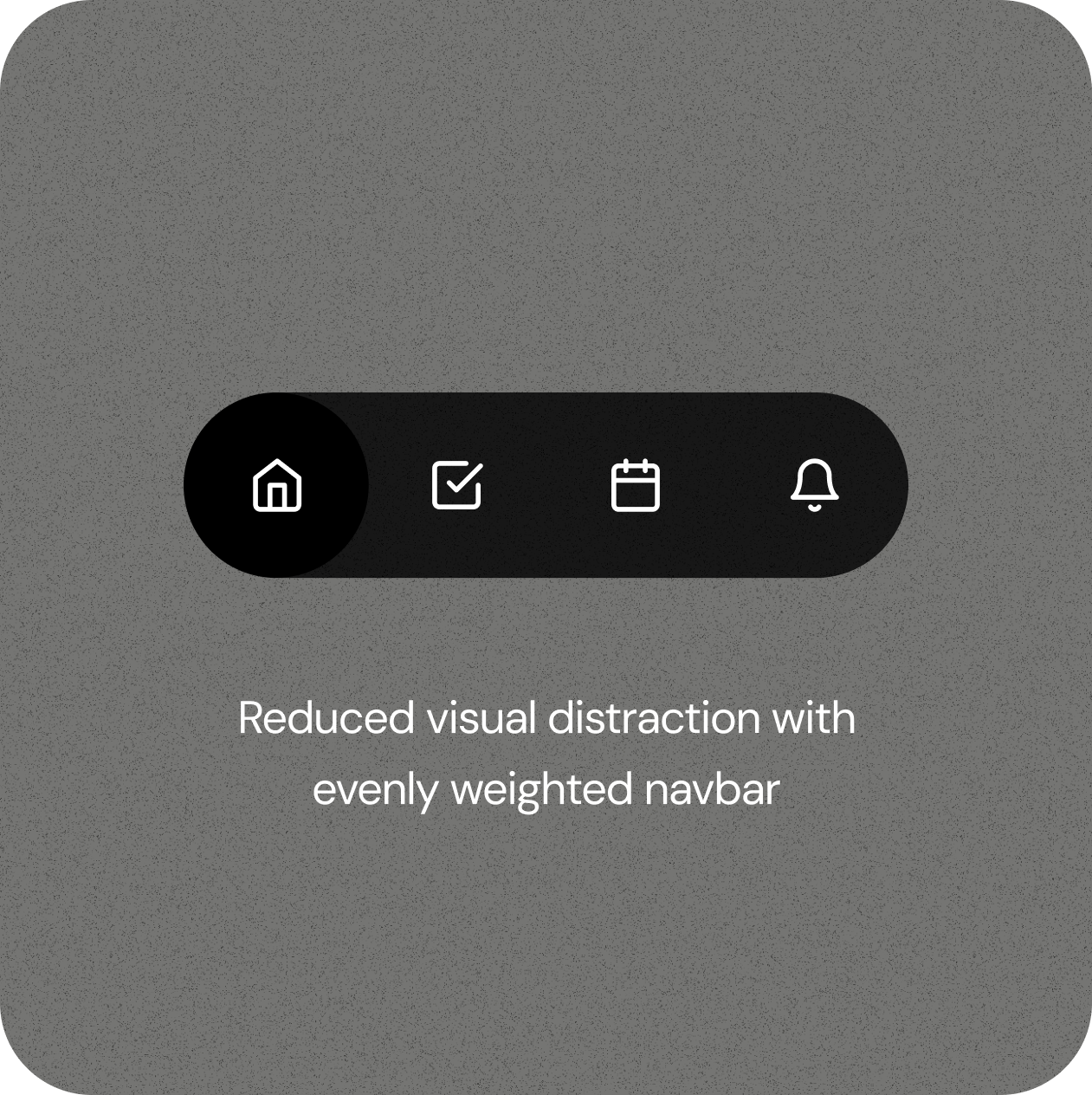
Establishing consistency across screens for better usability and future scalability.
I approached each redesign with three guiding UX principles.
Reduced cognitive load with a cleaner, structured UI that aligns with student mental models and
introduced consistent interaction patterns to make features easier to understand at a glance.
Restructured content to surface critical actions first and applied progressive disclosure to avoid overwhelming users while still keeping details accessible.
To-Do’s are now color-coded and weighted by priority to drive better time management. Attendance status includes clear thresholds and warnings, so students don’t miss critical attendance requirements.